


Paint My Wall・AI Home Interior
3.830.00 Reviews
App Specs
- Version
- 1.6.1
- Updated On
- License
- Free
- Downloads
- 500,000+
- Developer
- Lascade
- Categories
- House & Home
- Platform
- Android, iOS
Screenshots
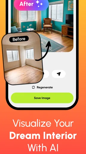
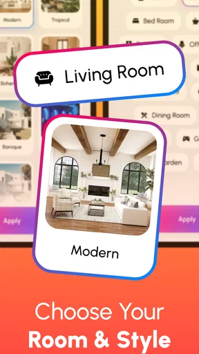
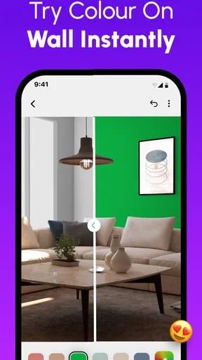
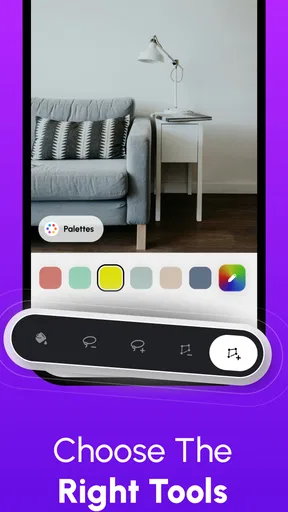
 Analysis by AppCompare
Before I settle on paint, I want to know how a color might feel in the actual room, not just on a small swatch. That is the practical problem Paint My Wall・AI Home Interior is meant to help with: it lets me explore color ideas against a picture of my space before I commit to changing it. I see it as a useful first step for a home project, not a replacement for checking real paint samples or making the final call in person.
It is a free home-design app from Lascade, with optional in-app purchases ranging from $0.99 to $11.99 per item. Its Everyone age rating makes it broadly suitable for household use, and its current version is 1.6.1 for devices running Android 10 or later. The app has a 3.8 average from around 6,100 ratings and has been installed over 500,000 times. Those figures give a sense of its reach, but the real question for me is whether its visualizer helps with the decisions that make choosing a wall color feel difficult.
From a Room Photo to a More Confident Color Choice
I’ll focus on how a room photo can turn a vague color hunch into a more useful conversation, while keeping the preview in its proper role: a way to compare possibilities, not a promise of the painted result. I also find it helpful to decide what must stay in the room before judging shades, since existing furniture and finishes can change which option feels right.
Start with the room you actually want to change
Ever found yourself staring at your walls and dreaming of a fresh coat of paint, but feeling lost in a sea of color swatches? Well, you’re not alone! I recently stumbled upon this nifty app called Paint My Wall・AI Home Interior, and it’s been a game-changer for my home makeover aspirations. Let me walk you through my experience with this app.
The most useful way to begin is with a specific decision, rather than browsing colors without a goal. Maybe a bedroom feels too dark, a hallway needs a lighter look, or the living room’s current color clashes with a rug. Having a particular wall and a reason in mind makes it easier to judge whether a preview is actually helping. If I am only collecting inspiration, I can explore more freely; if I am close to buying paint, I need to treat the image as a guide rather than a guarantee.
For a more informative room photo, I would take it in ordinary, even light and include the furniture and nearby surfaces that will remain after painting. A close crop of a blank wall can make a color seem more convincing than it will in a furnished room. I would also avoid judging a shade from a photo taken under strongly colored lamps: the camera’s capture of the room can affect the preview before the app even applies a new color.
That small preparation step matters because the visualizer is only as useful as the scene I give it. A photo with a clear view of the wall makes it easier to think about the overall effect, while clutter, deep shadows, or objects covering much of the surface can make the result harder to read. I would take a couple of pictures from different viewpoints if the room has an awkward layout, then compare the same color idea against both rather than making a decision from one flattering angle.
Worth Reading Before You Choose

EA SPORTS FC Mobile 26 Is a Bigger Football Game, but It Takes Time

Flipboard Shows What News Apps Must Do Beyond the Feed

Switching to Android Auto Means Rethinking Your Driving Routine

Google Calendar Makes a Crowded Week Easier to Manage

Ludo King Makes the Most of the Minutes Between Plans

Baby Panda World Brings Quick Play to Modern Phones, but Its Game Library Feels Busy
Getting Started with Paint My Wall・AI Home Interior
First off, I was immediately drawn to the app’s sleek and user-friendly interface. Downloading it from the app store was a breeze, and in no time, I was ready to explore all its features. The app offers a step-by-step guide for first-time users, which was super helpful. I felt like I had a virtual interior designer right in my pocket!
Once I have a room image, the sensible workflow is to test a few noticeably different directions before narrowing in on subtle variations. I might compare a warm neutral with a cooler one, or try a muted shade against a stronger accent, then return to the option that works best with the room’s existing pieces. This is more useful than rapidly tapping through many near-identical colors, because the big contrast first tells me what kind of mood I prefer.
I would keep the room’s fixed details in view while making those comparisons. Wood floors, trim, countertops, and large pieces of furniture all influence whether a wall color feels balanced. A shade that looks attractive by itself may make a wooden floor seem orange or turn a dark sofa into the visual center of the room. The app can help me notice those relationships, but it cannot decide which trade-off I am happy to live with.
The app’s broader appeal is that it gives a visual starting point without asking me to repaint a wall just to test an idea. That is especially handy when a household is divided between two possible directions: seeing the colors applied to the same room can make the conversation more concrete. It is still worth comparing on the same photo and keeping the lighting consistent, so the choice reflects the colors rather than different pictures.
Exploring the Features
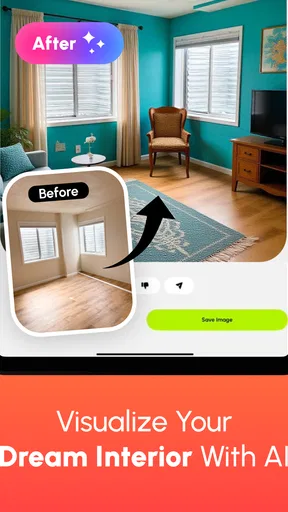
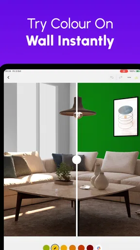
The heart of Paint My Wall・AI Home Interior is its AI-driven technology that allows you to visualize different paint colors on your walls. All you need to do is snap a picture of your room, and the app works its magic. I tried it in my living room, and it was fascinating to see how each color transformed the space.
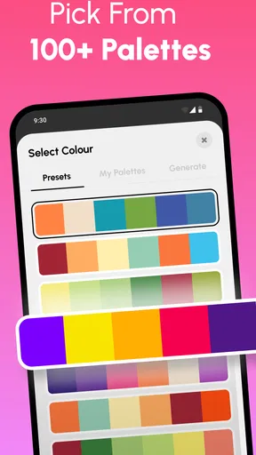
What really stood out to me was the app’s vast color palette. From soothing pastels to bold, striking hues, the options seemed endless. You can even save your favorite colors to a personal palette for easy access later. This feature made it easy for me to compare different shades and decide on a cohesive color scheme for my home.
Saving candidates is more than a convenience when a decision stretches over several days. I would use the personal palette as a shortlist, not as a scrapbook of every color that catches my eye. Keeping only a handful of contenders makes it easier to compare them later and reduces the temptation to reopen the whole search each time. I would also note why each one made the shortlist—for example, that it works with the sofa or brightens a dim corner—so the choice is grounded in the room rather than in a shade name alone.
A useful comparison is to test one wall color at a time while leaving the rest of the room unchanged. If I alter several decisions together, I may like the overall image without knowing which change helped. For an open-plan area, I would check the color from the main viewpoint and from the adjoining space too. A wall can look calm from the sofa yet feel abrupt when seen beside a neighboring room.
Compared with browsing paint-store swatches, a room visualizer is better at showing the broad effect of color against my own furniture and layout. Swatches, on the other hand, are better for checking the actual material and observing it in changing light. Compared with manually editing a photo, an app built for wall-color visualization is a more direct way to explore paint ideas, though a manual editor may suit someone who wants detailed control over every part of an image. I would use these approaches as complements rather than expect one to settle everything.
Personalization at Its Best
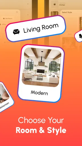
One of the coolest features is the app’s ability to suggest color combinations based on your existing furniture and decor. I was initially skeptical, but after trying it out, I was impressed! The suggestions were spot-on, and it felt like the app really "got" my style.
Even when a suggestion seems right, I would treat it as a prompt to examine rather than an instruction to follow. A recommendation can help me get unstuck, especially if I have been circling the same safe neutrals, but my room’s practical use matters too. A restful bedroom, a busy family room, and a narrow passage can call for different choices, even if the furniture palette is similar. I would ask whether the suggested color supports the way I want the room to feel, not simply whether it coordinates with the objects in the picture.
For a shared home, a good handoff is to save a few finalists and show them to the people who use the room. Instead of asking, “Do you like this color?” I would ask which option feels comfortable for a whole evening or which one works with the items that cannot be moved. That gives feedback a practical focus. The app makes it easier to discuss the same visual possibilities, but it does not remove the need to agree on the room’s purpose and the amount of color everyone is comfortable seeing every day.
For those who are unsure about their design choices, the app offers inspirational galleries and even connects you with professional designers. I didn’t use this feature myself, but it's great to know it's there if you need some extra guidance.
That makes the app more appealing to someone who wants a bridge between solo browsing and getting another opinion. I would use inspiration to find a direction, then return to my own room photo to see whether that direction suits my space. A gallery image can be polished and appealing without matching my room’s light, floor, or furniture, so I would avoid treating an attractive example as proof that the same combination will work at home.
When the preview meets the real room
The true test came when I decided to actually paint one of my rooms based on the app’s suggestions. I took a leap of faith and chose a deep teal for my bedroom. The app provided me with a list of local stores where I could purchase the exact shade. Talk about convenience!
For a realistic everyday example, imagine that I am considering a bedroom refresh after noticing the existing wall looks flat in the evening. I take a picture that includes the bed, curtains, and flooring, then try a few color families rather than immediately committing to one dramatic shade. I save the strongest candidates, look at them again later, and ask whether each one works with the textiles I plan to keep. If one seems promising, I can take that idea to a paint counter and check a physical sample before buying enough for the room.
That last handoff is important: a screen preview helps with composition and direction, while a real sample helps with the paint itself. I would compare a sample in the room at different times of day, because daylight and evening lamps can make the same color feel quite different. If the exact shade is not available where I shop, I would use the preview as a reference for the general tone and ask about a close alternative rather than assuming the digital color will translate precisely.
Seeing the color in real life was a revelation. It matched perfectly with the digital preview, and I couldn’t have been happier with the result. The app definitely delivered on its promise to take the guesswork out of home painting.
My positive result does not mean every screen preview will match every painted wall. Displays differ, photos interpret light, and paint finishes can change how a color appears once it covers a large surface. I would still make a small real-world test part of the decision, especially for a strong color or a room with mixed lighting. That extra check is a modest effort compared with repainting a whole space after discovering the shade feels different in person.
Where this tool fits—and where it does not
For me, the app is best for people who know they want to refresh a room but cannot picture the color on their own walls. Renters who are planning a future home, homeowners preparing a modest makeover, and anyone comparing a few paint directions can all get value from seeing ideas against a room photo. It is also useful when I want to explain a preference to someone else without relying on vague descriptions like “a softer green.”
I would skip it as the main decision tool if I needed exact color matching for a renovation, if a wall has unusual texture or complicated edges that make a photo preview hard to interpret, or if I already know the precise paint and finish I want. In those cases, a physical sample or advice from a paint professional is a better next step. Likewise, anyone expecting the app to take over the whole renovation plan should keep expectations narrow: its strongest role is helping visualize wall-color ideas.
There is also a practical distinction between free use and optional purchases. The app is free to start with, but some items are offered as in-app purchases. I would explore the parts relevant to my project before deciding whether any paid item is worthwhile, rather than assuming every feature or resource comes at no cost. That keeps the app in perspective as a low-friction way to investigate color, not an obligation to spend more to make a decision.
Overall, my experience with Paint My Wall・AI Home Interior was overwhelmingly positive. The app’s intuitive design and powerful features made the daunting task of choosing paint colors not only manageable but fun. Whether you’re planning a major home renovation or just want to experiment with new colors, this app is a must-have tool in your arsenal.
So, if you’re ready to give your walls a fresh new look without the stress, I highly recommend giving Paint My Wall・AI Home Interior a try. It’s like having a personal interior designer, minus the hefty price tag!
Pros
- Intuitive interface for easy navigation.
- High-quality AI-generated design suggestions.
- Wide variety of colors and textures.
- Real-time preview of changes.
- Minimal lag for seamless experience.
Cons
- Limited free features available.
- Occasional inaccuracies in AI suggestions.
- Requires internet connection to function.
- Some textures lack realistic detail.
- Subscription model can be pricey.
FAQs for Paint My Wall・AI Home Interior
What is Paint My Wall・AI Home Interior?
Paint My Wall・AI Home Interior is an innovative app designed to help users visualize and redesign their living spaces using augmented reality (AR) and artificial intelligence (AI). The app allows users to experiment with different colors and textures on their walls, offering a realistic preview before making any physical changes.
How does the AI feature enhance the user experience?
The AI feature in Paint My Wall・AI Home Interior analyzes your space and suggests colors and designs that complement your room's lighting and layout. It learns from your preferences and provides personalized recommendations, ensuring that your interior design choices are both aesthetically pleasing and practical.
Is Paint My Wall・AI Home Interior easy to use for beginners?
Yes, Paint My Wall・AI Home Interior is designed with user-friendliness in mind. The intuitive interface guides users step-by-step through the process of selecting and applying colors. Even those with no prior design experience can easily navigate the app and make informed decisions about their interior spaces.
Does the app support both Android and iOS devices?
Paint My Wall・AI Home Interior is available for both Android and iOS platforms. Users can download the app from the Google Play Store or Apple App Store, ensuring a wide range of device compatibility and accessibility for different smartphone users.
Are there any in-app purchases or subscriptions required?
While Paint My Wall・AI Home Interior offers a free version with basic features, there are optional in-app purchases and subscription plans available. These provide access to premium features such as exclusive color palettes, advanced AI recommendations, and high-resolution previews, enhancing the overall user experience.


